



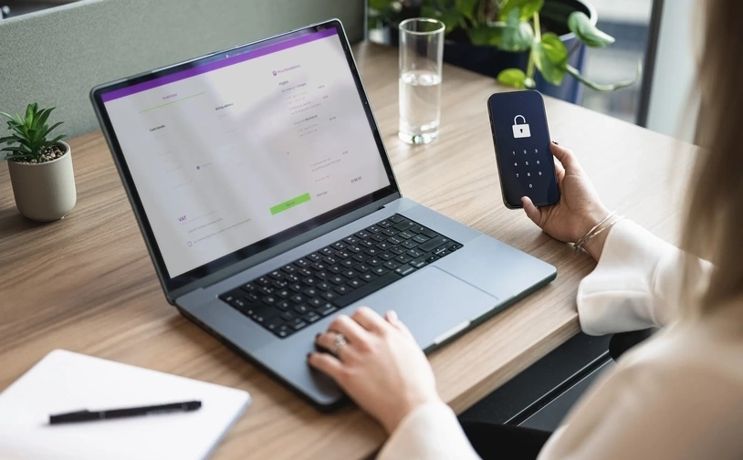
- Optimised web design: make browsing a breeze
- Speed demons: fast loading times to turn clicks into cash
- Mobile mastery: optimising for on-the-go shoppers
- Boost your average order value: easy wins for bigger profits
- The art of the checkout: simple steps to more sales
- Sell more with smart strategies: upselling and cross-selling
- Conversion magic: turning visitors into buyers
Why should I optimise my website for mobile?
Smartphones are becoming increasingly popular for shopping online, with 87% of smartphone owners using their devices to purchase products. So, it makes sense to maximise your ecommerce website to make mobile sales fast and frictionless for your customers.
For ecommerce business owners, encouraging smartphone sales means they need to ensure their online shop is mobile optimised. Optimising your website for mobile simply means ensuring your site is formatted in a way that is easy to view and navigate on a mobile device.
Mobile commerce sales are expected to account for 67% of all retail sales by 2030
Optimising your website for mobile can help to improve customer experience, making it easier to complete a purchase and therefore increasing conversion rates and revenues. It can also aid in improving website speed, which in turn can improve how well your website performs in mobile search results.
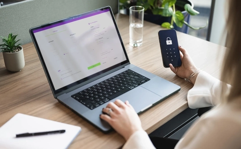
With the knowledge that more and more people are using a mobile to browse the internet and shop online, you need to make sure there are no barriers or friction when a customer visits your website. In today’s world, people are often busy, stressed and impatient. They will not wait for a page to load or try to work out how to add a product to their carts. So, you need to make their experience a positive one – otherwise they won’t convert and make the purchase.
Mobile ecommerce or ‘m-commerce’ is taking off in a big way globally. Global m-commerce leaders are emerging, particularly across South-East Asia in Chinese, Japanese and South Korean markets.
Why you should consider optimising your site for mobile
Improves user experience
You need to ensure your customers can navigate your website with no problems or friction, so you must make sure that the appropriate mobile optimisation has been made. If you create an all-round positive user experience, your customers will come back!
Increase the average time spent on your site by mobile users
A mobile optimised website will keep your smartphone users on your site for longer and see them engage a lot more.
Websites load faster
When you optimise your website for smartphones, loading times greatly decrease. This is because pictures and text will automatically render at the correct resolutions.
Better search results for your site
If you have two versions of your website, traditional and mobile, the smartphone version will be displayed first for mobile users. This means that you will be way ahead of your competitors if they do not have a mobile optimised site, by being further up in the search results.
“It’s all about removing friction. Remove every barrier possible between the customer and the checkout so it’s as easy as possible to pay. Some pain points are necessary – like fraud checks – but removing obstacles to paying can only improve your customers’ experience and drive up sales.
James King, Vice President Product – Payment Integrations, Elavon Europe
Cart abandonment rates on different devices
Almost 70% of shoppers abandon their carts, but people behave differently when shopping on desktop compared to tablets and mobile devices:
Desktop
65 - 67% of customers abandon their carts on desktop.
Tablet
On tablets, cart abandonment rate goes up to 70%.
Mobile
Mobile users have the highest cart abandonment rate, with 80% of shoppers failing to make it to checkout. However, unlike traffic from tablet devices, which make up a tiny percentage of ecommerce sessions, mobile traffic accounts for more than two-thirds of all ecommerce sessions, at 73%.

Increasing mobile website traffic is not the only reason to ensure that your website is mobile optimised. With Google’s mobile-first indexing, sites that have been optimised for mobile users will rank higher in search engine results. This can allow ecommerce stores to reach a wider pool of potential customers.
Taking the time to invest in mobile optimisation techniques can also help to increase conversion rates on mobile devices. Ensuring your site is easy to navigate via a smartphone is becoming increasingly important for sales revenue. Optimising for mobile also creates a more consistent user experience and can serve to enhance your brand image and ensure your customers keep returning to your store.
“Smartphones have transformed the behaviour of almost all consumers and they’re increasingly demanding a uniform experience across multiple sales channels.”
Michael Bosshammer, Head of Retail, Elavon Europe
Six ways to optimise your site for mobile
Your website is often the first place of contact that your customers will encounter. You’re far more likely to make a sale or retain a customer if you provide mobile visitors with a site that is accessible and as fully functional as on a PC or laptop. It makes sense to maximise your ecommerce website to make mobile sales fast and frictionless for your customers. Here are our six top tips for optimising your website for mobile.
More than half (53%) of app users will uninstall apps that take more than two seconds to load. More than 90% of people stop using an app within 30 days, with poor app performance the most-frequent reasons.
Nearly half of online consumers prefer to check out as a guest for two key reasons: they believe it’s faster than creating an account, and they don’t have to input as much personal information.
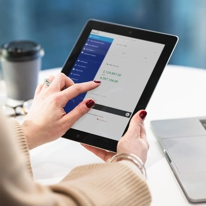
Mobile online shopping (or m-commerce) is quickly becoming the new normal. Ensuring that your ecommerce website is optimised for all your website visitors will allow your site to remain competitive and help prevent cart abandonment.


Helping thousands of customers around the world grow their business through payments
Customer service and support
We’re here to help!
Customer service: 0818 20 21 20
Telephone: Monday to Friday, 8am to 5pm
Chat: Monday to Friday, 8am to 6pm
Elavon technical support: 0818 30 31 30
24 hours a day, 365 days a year
Opayo product support: 01 240 8731
24 hours a day, 365 days a year
Copyright© 2025 | U.S. Bank Europe DAC. Registered in Ireland – Number 418442. Registered Office: Block F1, Cherrywood Business Park, Dublin 18, D18 W2X7, Ireland.
U.S. Bank Europe DAC, trading as Elavon Merchant Services, is regulated by the Central Bank of Ireland.
We are regulated by the Central Bank of Ireland for our acquiring, transaction risk analysis, and dynamic currency conversion services. For all other products and services we provide, please note the following: Warning: The provision of this service does not require licensing, registration, or authorisation by the Central Bank of Ireland, and as a result is not covered by Central Bank of Ireland rules designed to protect consumers or by a statutory compensation scheme.
Helping thousands of customers around the world grow their business through payments
Customer service and support
We’re here to help!
Customer service: 0818 20 21 20
Telephone: Monday to Friday, 8am to 5pm
Chat: Monday to Friday, 8am to 6pm
Elavon technical support: 0818 30 31 30
24 hours a day, 365 days a year
Opayo product support: 01 240 8731
24 hours a day, 365 days a year


Copyright© 2025 | U.S. Bank Europe DAC. Registered in Ireland – Number 418442. Registered Office: Block F1, Cherrywood Business Park, Dublin 18, D18 W2X7, Ireland.
U.S. Bank Europe DAC, trading as Elavon Merchant Services, is regulated by the Central Bank of Ireland.
We are regulated by the Central Bank of Ireland for our acquiring, transaction risk analysis, and dynamic currency conversion services. For all other products and services we provide, please note the following: Warning: The provision of this service does not require licensing, registration, or authorisation by the Central Bank of Ireland, and as a result is not covered by Central Bank of Ireland rules designed to protect consumers or by a statutory compensation scheme.

Essential cookies enable core functionality such as page navigation and access to secure areas. The website cannot function properly without these cookies; they can only be disabled by changing your browser preferences. Please see our Cookie Policy for further information.
Performance cookies help us to improve our website by collecting and reporting information on its usage (for example, which of our pages are most frequently visited).
These cookies and similar technologies gather information about your browsing habits. They remember that you've visited a website and share this information with other organisations, such as advertisers and platforms on which we advertise. They do this in order to provide you with advertisements that are more relevant to you and your interests. These cookies and similar technologies gather information about your browsing habits. They remember that you've visited a website and share this information with other organisations, such as advertisers and platforms on which we advertise. They do this in order to provide you with ads that are more relevant to you and your interests.
These cookies are stored under a different domain than www.elavon.ie. They are mostly used to track you between websites and display more relevant advertisements between websites.
Find out more about cookies on https://www.allaboutcookies.org